Recent Work

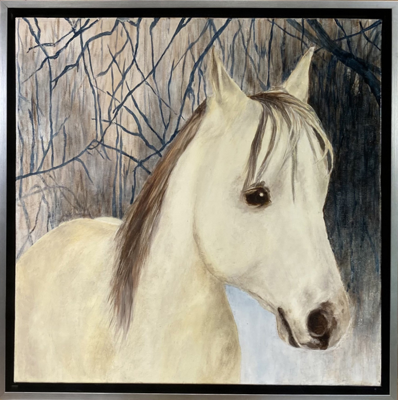
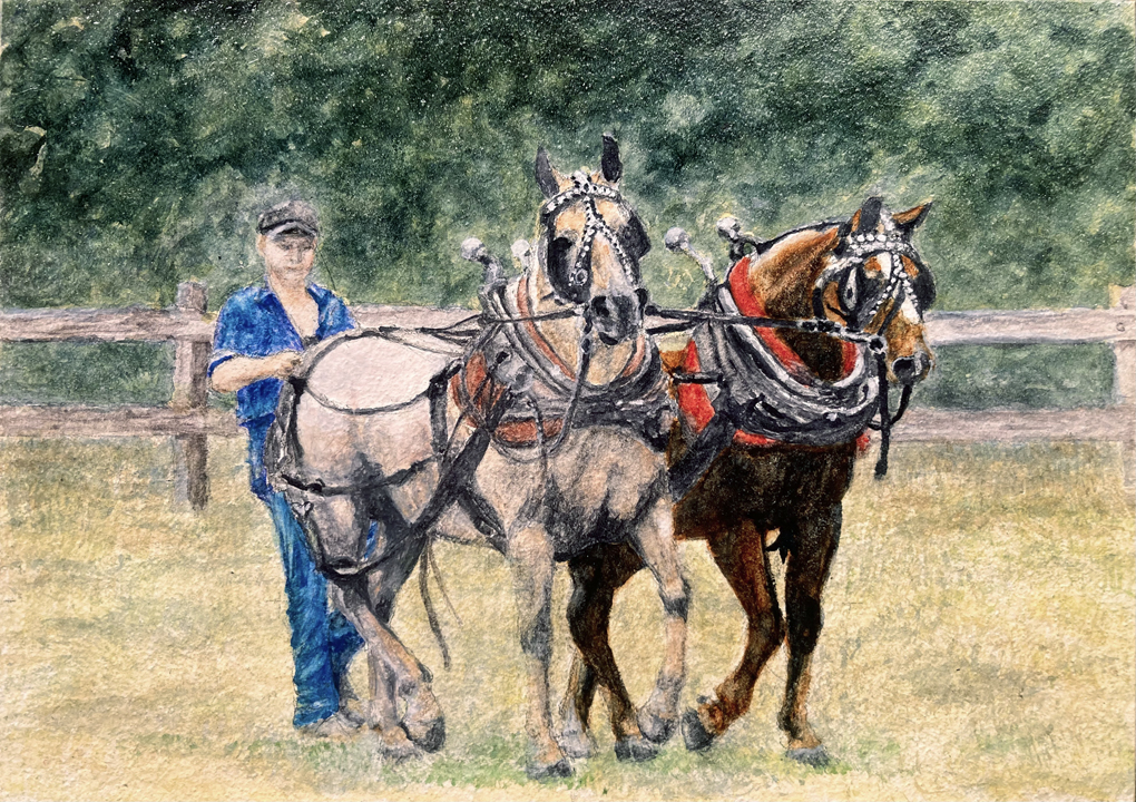
A tiny painting full of painstaking detail but totally worth the effort! This was a commissioned watercolor on a 5" x 7" Aquabord™ panel. The source photograph was teensy tiny too, and a bit blurred just for good measure. A few RV vehicles in the background were removed and replaced with more trees. The horse on the left was the favorite of the young man (at the time) holding the lines. His beloved horse, Dan, died recently at age 29 and this was a sister's memorial gift to her brother to honor Dan. I loved painting this one even though I felt like I was getting lost at times in the intricacy of the harness and the complexity of keeping track of all three creatures and keeping them all in their proper space. My reward, as has always happened up till and including this painting, is that both client and recipient love the final product!


Dez

This cute horse is a commission from a client I did a portrait for ten years ago. At that time I painted her grandfather's horse, Fred. Ten years later, that portrait hangs in her son's bedroom. She wanted this one of her own horse, Dez, to be displayed together with Fred.

It was interesting to me that both portraits presented the same challenges, namely, remove rider and tack, and create a whole new background. And both required several source photos to get all the parts that had been hidden by the tack and rider back into the proper place on the horse. Thankfully I was able to pull that off for both portraits. They are even framed the same way, in a black floater frame with a silver edge around the top. A perfect match!


The following paintings are all part of the Sky Pads Series, but here I've added some thoughts about the creative process and the direction they might be taking as I go along.


The Sky Pads series, quite a project!


Sky Pads 1

Sky Pads 1, first in a projected series of 10, which has now become 34...and will apparently keep increasing until I have exhausted all possibilities! It was inspired by the illusion of lily pads floating in clouds, which were reflected in the water of the Mill Pond located behind my house. This painting is available on the Water Lily Interpretations page.


Sky Pads 2Sky Pads 2, with new colors and a slightly different technique. I expect these changes to continue as the series progresses, which is what makes it fun and interesting. This painting is available on the Water Lily Interpretations page.


Sky Pads 3

Sky Pads 3, developing the water patterns. This painting is available on the Water Lily Interpretations page.


Sky Pads 4

Sky Pads 4, an experiment with a lovely vertical cascade, preserving the color palette of the two previous paintings in the series. This painting is sold.


Sky Pads 5

Sky Pads 5 continues the vertical concept, and adds a more ethereal look with transparencies and highlights. Now it's not as certain what kind of surface the pads are floating upon. This painting is available on the Water Lily Interpretations page.


Sky Pads 6

Sky Pads 6 adds even more complexity to the layers, blending surface with reflections and shadows, topped with a misty quality. This painting is available on the Water Lily Interpretations page.


Sky Pads 7Sky Pads 7 emphasizes the importance of the environment over the presumed subject matter. The deepness of the many color layers gives this painting a richness and a mystery that could not be achieved by concentrating on the physical lily pads alone. This painting is available on the Water Lily Interpretations page.


Sky Pads 8

Sky Pads 8 is a bit of a throwback to Sky Pads 2, illustrating the circular nature of this series, which is more of an exploration than an orderly progression. This painting is sold.


Sky Pads 9

Sky Pads 9 is a return to the color palette of Sky Pads 1, with more emphasis on the clouds and reflections in the water than was evident in the earlier version. This painting is available on the Water Lily Interpretations page.


Sky Pads 10

Sky Pads 10 is the first in the series to address the vertical aspect of water lilies. This composition offers a study in contrast between the flatness of the pads and the energetic upward reach of the stemmed leaves. The strong shadows add a third dimension, then all three are melded together by the binding effects of the color layers. This painting is available on the Water Lily Interpretations page.


Sky Pads 11

Sky Pads 11 is the largest painting in the series so far, and at 4 feet by 5 feet it benefited from all the various exploratory techniques which preceded it. All of the ephemeral watery/cloudy/foggy effects are here, coupled with strong movement of colors and lily pads and leaves that fade in and out of a moody liquid context. The observer will create the scene. The artist has provided the raw elements. This painting is available on the Water Lily Interpretations page.


Sky Pads 12

After a bit of a hiatus, Sky Pads 12 is finished. At 36" x 48" it is in the size range of most of the series. This one is the most vibrant, color-intense painting yet, which does not surprise me since as I progress in a series an increase in color saturation and contrast is what is likely to happen. This painting is available on the Water Lily Interpretations page.


Sky Pads 13

With Sky Pads 13 I thought it might be a good idea to try to backtrack a bit toward the ethereal light quality of some of the earlier Sky Pads paintings. After the "paint riot" that was exemplified by number 12, I knew it would be difficult to regain a light touch but I really felt that this particular composition demanded it. To me this painting represents sort of a half-way point between the early works and Sky Pads 12. I hope to stick around in this interpretation for at least a little while. This painting is available on the Water Lily Interpretations page.


Sky Pads 14

Sky Pads 14 is a few steps further along the stylistic path begun by #13. A bit more subtle in its illusion of depth with a bit more of water surface reflection for the viewer's eye to play with.  This painting is available on the Water Lily Interpretations page.


Sky Pads 15

Sky Pads 15 took the color palette from #9 and heightened saturation, brightness, and contrast. There isn't much of a suggestion of clouds in this one, but rather a focus on looking directly into the shallow water searching for underwater forms created by the sinking of deteriorating foliage and the eruption of new leaves which have still not risen above the water's surface. This painting is available on the Water Lily Interpretations page.


Sky Pads 16

I have nicknamed Sky Pads 16 "Sweet Sixteen"--it just seemed like a happy number to finally arrive at. I've got plans for #17, because there is no set limit on how far this is going to go. In the meantime, I'm appreciating how this painting really does make the pads look like they're suspended in clouds.This painting is available on the Water Lily Interpretations page.


Sky Pads 17

The intriguing background for Sky Pads 17 came about purely by accident. All of the paintings in this series have an initial poured paint background but it never turns out the same because it is essentially random. In this one, the paint separated itself out of the paint thinner I used to make it a thin liquid, creating this nice sense of flow under the pads. This painting is sold.


Sky Pads 18

I was hoping to duplicate the poured background technique used in Sky Pads 17, and #18 looks to be a successful effort. I felt that the fact that the paint was poured on a sweltering hot day was an important factor, so I waited for the weather to heat up again. Sky Pads 18's composition is more complex than its predecessor but it still partners with the flowing background in an eye-catching way. This painting is available on the Water Lily Interpretations page.


Sky Pads 19

Sky Pads 19 continues the new direction with the natural effect of the poured paint background. This painting is available on the Water Lily Interpretations page.


Sky Pads 20

Sky Pads 20 adds a little element of floating fantasy to the randomness of the poured paint. This painting is sold.


Sky Pads 21Sky Pads 21 is the first painting in the "flowing background" style that I have tried in cold weather. Sky Pads 17 through 20 were all started on quite hot days, which aided in getting the pigments in the poured paint wash to separate out into interesting patterns. At first I thought the background was too undefined, but decided to go along with it anyway and see what would happen. I'm glad I did, as this ephemeral background turned out to be perfect against the strong shapes of the lily pads. This painting is available on the Water Lily Interpretations page.


Sky Pads 22

It's always a challenge to pick colors for this series. I don't want them to all look alike; in fact that would be difficult since I would get bored very quickly. In all cases, the color of the pads is influenced by the randomness of the poured-paint background. This one, number 22, is startling in its variations on a red theme. I had no idea when I created the background that this would be such vibrant result! This painting is available on the  Water Lily Interpretations page.


Sky Pads 23

Sky Pads 23 is the first time I've been able to create different flow directions in the poured paint background. The paint in this case was fairly dense in places and it took me a while to decide what colors would make the lily pads stand out best. A gold/rich brown combination did the trick. This painting is available on the Water Lily Interpretations page.


Sky Pads 23

Sky Pads 24 is another serendipitous accident. I knew what the lily pad pattern would be, but had no idea about the character of the background that would be best. I was using a different kind of paint thinner to pour this background and it was doing strange things--quite different from previous efforts. I ended up loving the rippling pebbly effect of the imaginary water! This painting is available on the Water Lily Interpretations page.


Sky Pads 25

Some new color combinations got introduced for Sky Pads 25. Bright blue-green over a subtle background of yellow-red-blue makes for some eye-pleasing blends of each. The sharp shadow contrasts add interesting patterns without interfering with the main idea of lily pads floating in the sky. This painting is available on the Water Lily Interpretations page.


Sky Pads 26

Sky Pads 26 probably "pops" its colors a little more obviously than some of its predecessors. I was pleasantly surprised by the lovely top to bottom transition of the red/yellow combination to the red/purple combination, and how well both combinations integrated themselves with the background. This one gives me the feeling that sunshine is simply bouncing off the leaves. This painting is available on the Water Lily Interpretations page.


Sky Pads 27

Sky Pads 27 took a bit of a radical journey away from its immediate predecessors. It's more like an amplification of Sky Pads 15 but with more depth and color. I'll have to wait for summer to see if I can get any more source photos in a similar vein to this one. This painting is sold.


Sky Pads 28

Sky Pads 28 is reminiscent of #20, especially the background. It's very difficult to duplicate a poured paint background, so I was pleased that this one turned out in the same emotional sphere as #20. I'm also really pleased with the shadows cast on the flat pads. We have two different types of lily pads that still manage to look like they belong in the same painting. This painting is available on the Water Lily Interpretations page.


Sky Pads 29

Sky Pads 29 is an extension of #27, or as I put it in my blog when I completed it, it's #27 on steroids. The pads in this one seem to really pop right off the canvas. It's hard to imagine that water lilies can look this dramatic, but this representation is done from real honest-to-goodness pads right in my back yard. This painting is sold.


Sky Pads 30

Sky Pads 30 increased the complexity of the subject matter while simplifying the background a bit. The idea in this one was to allow the viewer to peer into the water and see both the stems sinking into it and the leaves arising out of it. I also liked the proliferation of various sizes, shapes, and colors of the leaves. This one almost screams "Spring" even though it was completed the last week of a rather chilly wet December. This painting is available on the Water Lily Interpretations page.


Sky Pads 31

Sky Pads 31 incandescent

This is the same painting, Sky Pads 31, in two different lighting situations. I mulled over the lighting effects for quite some time, trying to decide if I should alter the values of the painting or simply explain the effect different lighting would have on how the painting was viewed. I ultimately decided to leave it alone and offer an explanation. The top version was photographed in natural outdoor daylight and is true to what the painting would look like on a wall that was near a window. The bottom is the painting photographed when lit by ordinary incandescent lighting, and is how it would appear near incandescent bulbs or LED bulbs calibrated to the same light spectrum as an incandescent bulb, 2400° Kelvin.

I really like both versions and I think it would be fun to move the painting around occasionally and take advantage of the variety. So I thought I would let everybody else see if they felt the same way. Purchase this painting and you are in effect getting two for the price of one! This painting is available on the Water Lily Interpretations page.


Sky Pads 32

Sky Pads 32 is the first one to be configured in a smaller size. I didn't think it would have a much different feel to it, but it turned out to be significantly different from its larger cousins. I had to force myself not to get bogged down in detail with this one, having completely forgotten that smaller images invite excessive detail. I was used to having broader freedom with the larger ones, so I was pleased that I was able to adapt my technique to this smaller version.This painting is available on the Water Lily Interpretations page.


Sky Pads 33

Sky Pads 33 is another smaller size, but just as layered as its predecessors. It has a lovely cloud effect melting into a flowing watery current. As in the rest of the series, this painting's background is pure serendipity. I can try to guide it, but most of the time I just get lucky! This painting is available on the Water Lily Interpretations page.


Sky Pads 34

Sky Pads 34 was a huge question mark right up until the very end. It was a multi-step process and more than once I said to myself I wish I had stopped at the previous step. However, I'm glad I didn't as the final pass gave me this lovely dreamy peaceful interpretation whose background and foreground are held together by a misty mysterious veil of white. This painting is available on the Water Lily Interpretations page.


Sky Pads 35Sky Pads 35 was another question mark, just not as big a one as #34. It was another case of adjusting the values of foreground vs background which was solved by making the lily pads darker but softer and the background with more of a suggestion of clouds than was originally there. This painting is available on the Water Lily Interpretations page.


Sky Pads 36

Sky Pads 36 is the first one to look like a rainy day. It was unintentional, but, there you go...! The leaves in this one are bright not because they're in direct sun, but because they are starting to decay. I prefer to paint flora with all its imperfections because I find it much more interesting that way. Maybe you will too? This painting is available on the Water Lily Interpretations page.

Sky Pads 37 is a diptych, each of the two panels is 4 feet wide and 5 feet high. I set this painting as a challenge when I started to realize that things were tending toward an unimaginative path. I had no workspace available to lay the panels side by side while pouring the paint and adding ripple patterns, so I had to measure where each pattern should continue from one canvas to the next and hope I got lucky. I spent a lot more time calculating than actual doing, but I think the calculations paid off and this painting gave me a push in a new direction.


Sky Pads 38

Sky Pads 38 is my first venture using lotus plants as the subject matter since my first series about lily pads in the 1990's. That series was called "Echo Park" and some of its contents can be seen on the Blast From the Past page. I was in the process of looking for something entirely unrelated to lily pads when I stumbled upon 5 or 6 really nice photos I had taken many years ago at Echo Park and mindlessly stashed away. Considering that winter is upon us now, I was overjoyed to find these photos because I was running out of local lily photos and there would be no more of those to photograph until summer. It turns out that I made a painting from this photo back in the day, but it looks totally different from the way this one turned out. See for yourself on the Blast From the Past page. It's "Echo Park XII".

The lotus plants have a lot of nice loopy droopy leaves that love to get in each other's way and also make a real drama out of unfurling themselves as they approach maturity. Their flowers can explode into white and pink colors in huge blooms. In contrast, the local Michigan plants, mostly spatterdock, have heart-shaped leaves and produce small-ish white or yellow flowers. Stay tuned, because the next painting will be lotus flowers, which even in my previous series I painted only sparingly. This painting is available on the Water Lily Interpretations page.


Sky Pads 39

Sky Pads 39's lotus is quite grounded, with all of its flowing movement crowded onto a small space of pond rather than in the heretofore home of the sky or sky reflections on water. This one truly invites your eye to travel! It is available on the Water Lily Interpretations page.